[ The Challenge ]
PhinC Group operated two entities — a parent company and its subsidiary — each with a distinct visual identity and separate communication channels. The existing branding was vivid but inconsistent, making it difficult to project a unified, professional image to clients across Europe and North America.
[ Our Approach ]
We modernized PhinC's visual identity while preserving its most distinctive asset — the signature pink — and unified both entities under a single, coherent brand system. The subsidiary now communicates through the parent company's channels, with GeoIP-based targeting for North American audiences.
[ Visual Identity ]
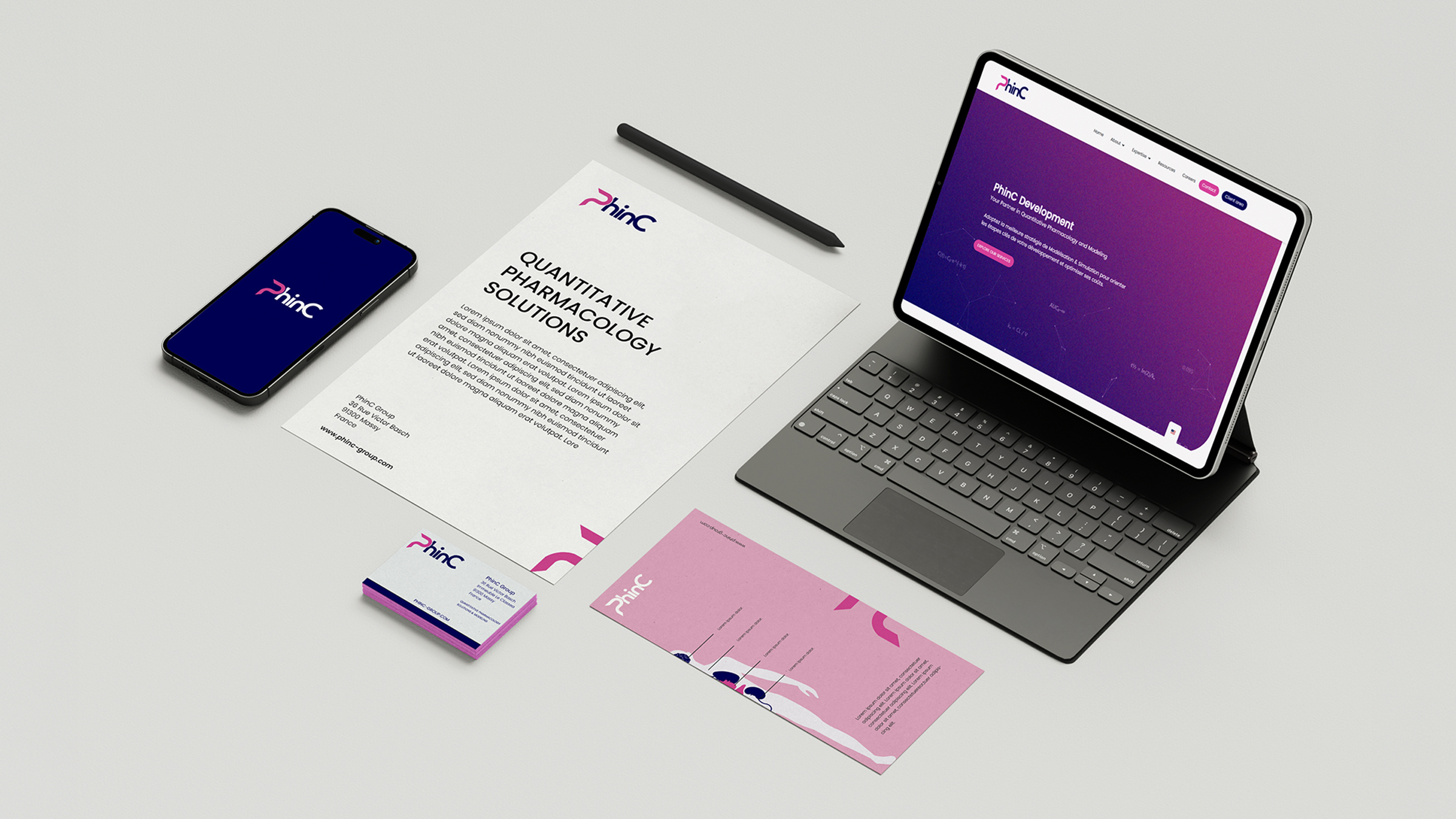
A modern identity rooted in heritage.
The redesign retained PhinC's iconic pink — a powerful differentiator in a competitive market — while refining typography, spacing and visual hierarchy to project a more premium, contemporary image.
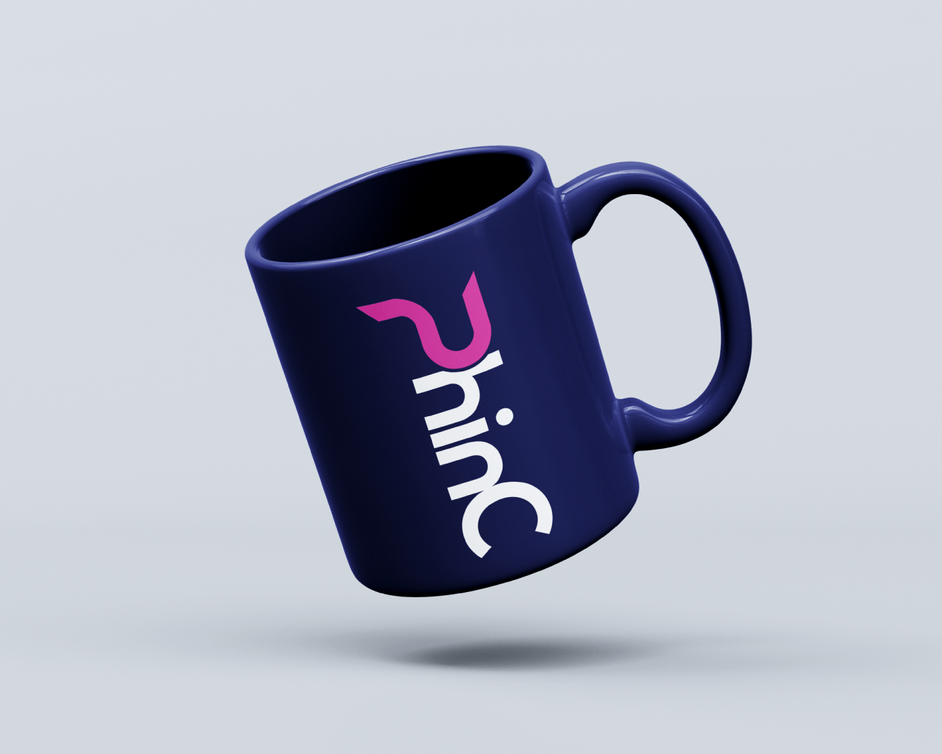
Brand application — Merchandising
[ Unified Communication ]
One brand. Two markets.
The subsidiary adopted the parent company's visual system and communication channels. A GeoIP strategy was implemented to serve tailored content to North American audiences, ensuring brand consistency without losing market relevance.
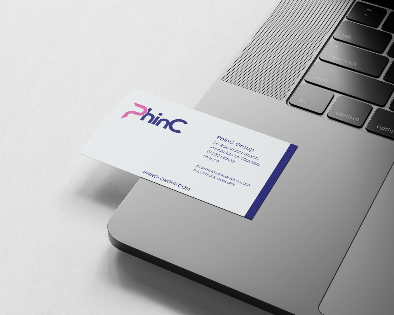
Brand application — Business Card